Share This Article
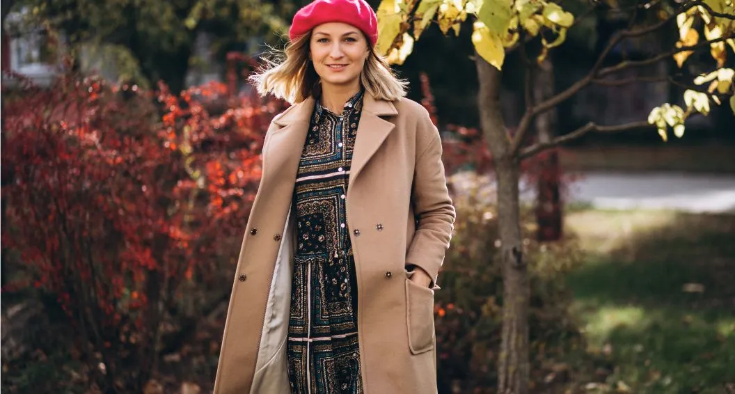
Do you find yourself drawn to cozy sweaters in camel and rust, or feel most confident wearing warm, earthy tones? If golden browns, soft teals, and muted oranges make your complexion come alive, you might be a Soft Autumn. The soft autumn color palette is one of the most versatile and wearable seasonal palettes, featuring warm, muted colors that create an effortlessly elegant and natural appearance.
Understanding your color palette transforms everything from your wardrobe choices to your makeup routine. In this amazing guide, I’ll walk you through the complete soft autumn color palette, including which colors enhance your natural beauty, how to avoid common mistakes, and practical strategies for building a cohesive wardrobe. Whether you’re just discovering seasonal color analysis or looking to refine your style, this comprehensive resource will help you embrace colors that truly work for you.
What Makes the Soft Autumn Color Palette Special
The soft autumn color palette sits at a unique intersection in seasonal color analysis, combining warmth with subtle, muted tones. These colors possess an earthy, grounded quality that feels both sophisticated and approachable.
Defining Characteristics of Soft Autumn Colors
Soft Autumn represents the bridge between Summer and Autumn in the 12-season color analysis system. Unlike True Autumn (which features richer, more saturated colors) or Soft Summer (which leans cooler), Soft Autumn showcases warm colors with a distinctly muted, dusty quality. Think of autumn leaves after the first frost—still warm, but softened and slightly grayed.
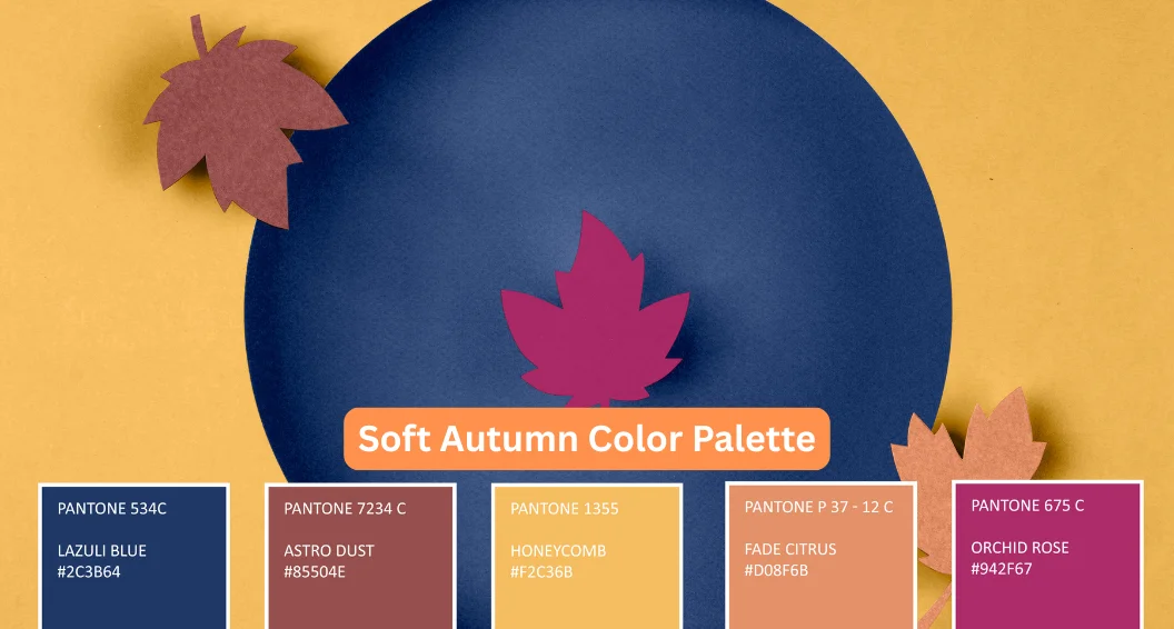
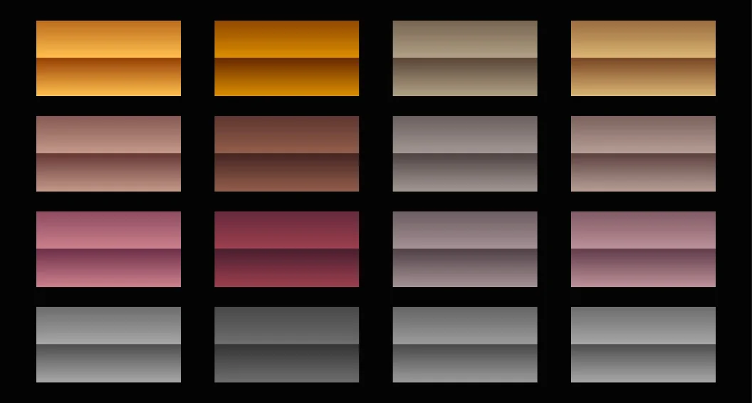
The palette typically includes 30-40 colors featuring golden, bronze, and olive undertones. What sets these colors apart is their low contrast and moderate saturation. They don’t shout for attention; instead, they create a harmonious, pulled-together look that feels natural and refined.
In my experience working with Soft Autumn individuals, these colors create an immediate “aha” moment. When you hold the right shade against your face, your skin looks clearer, your eyes appear brighter, and everything simply clicks into place.
Who Is a Soft Autumn?
Soft Autumn individuals have warm undertones with low to medium contrast between their hair, skin, and eyes. Your overall appearance likely has a soft, blended quality rather than striking contrasts.
Common Soft Autumn characteristics include:
- Hair in shades of golden brown, ash blonde with warmth, soft auburn, or mousy brown
- Eyes in hazel, soft brown, olive green, or teal blue
- Skin with golden, neutral-warm, or olive undertones
- Low to medium overall contrast
- Warm but muted natural coloring
You probably look better in gold jewelry than silver, and bright, clear colors might make you look washed out or harsh. If people have described your natural coloring as “soft,” “muted,” or “subtle,” you’re likely a Soft Autumn.
Your Complete Soft Autumn Color Palette
Understanding which specific colors flatter you most makes shopping and getting dressed infinitely easier. Let’s break down your palette by color family.
Neutrals That Form Your Wardrobe Foundation
Neutrals anchor every wardrobe, and Soft Autumns have gorgeous options that go beyond basic black and beige. Warm taupe serves as your ideal light neutral—sophisticated, versatile, and incredibly flattering.
Your essential neutral palette includes:
- Warm beige and cream
- Camel and khaki
- Warm brown (from coffee to chocolate)
- Olive green (yes, this works as a neutral!)
- Warm charcoal and pewter gray
Here’s something many people don’t realize: traditional black can be harsh on Soft Autumns. Instead, reach for soft black (charcoal with brown undertones) or dark brown when you want that sleek, dark neutral. These alternatives provide the same sophisticated effect without draining your complexion.
Off-white and cream work beautifully as light neutrals, while stark bright white can create unflattering contrast. I’ve found that replacing bright white with warm cream in my Soft Autumn clients’ wardrobes instantly elevates their entire look.
Your Most Flattering Warm Colors
This is where Soft Autumn truly shines—in the warm, earthy tones that feel like cozy autumn afternoons.
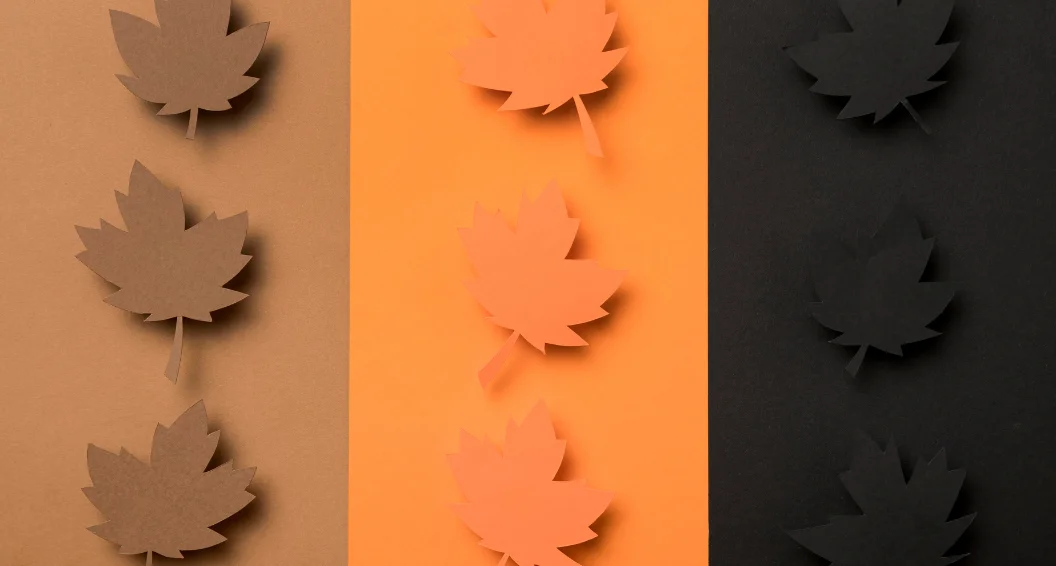
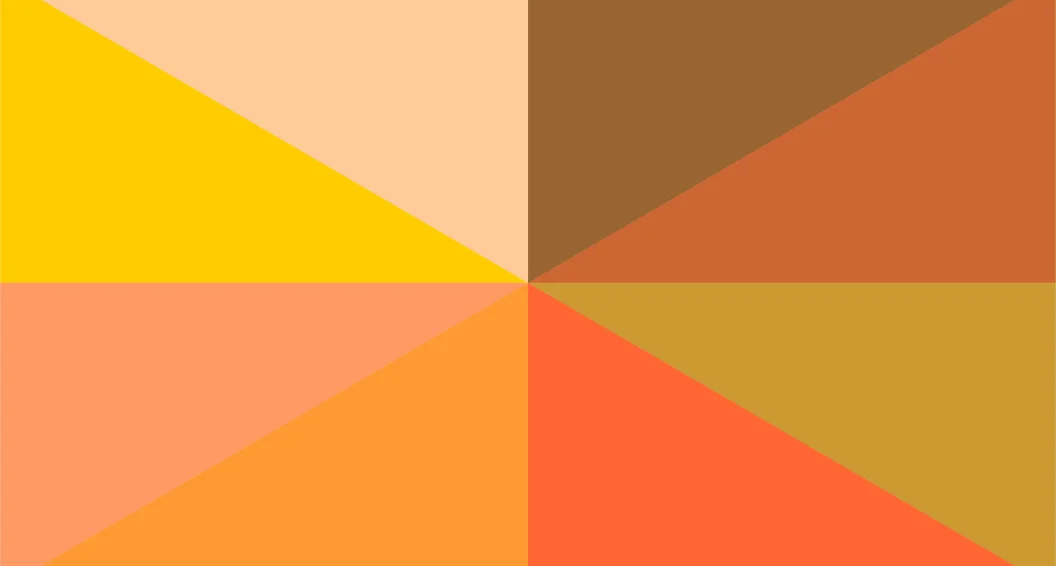
Orange and rust family: Soft coral, muted peach, terracotta, rust, burnt orange, and pumpkin create stunning accent colors. These aren’t bright, traffic-cone oranges; they’re softened, sophisticated versions that feel elegant rather than loud.
Red family: Soft Autumns can absolutely wear red—just the right reds. Look for tomato red, brick red, warm burgundy, and salmon. Avoid blue-based reds or bright cherry red, which clash with your warm undertones.
Yellow and gold family: Mustard yellow, golden yellow, warm sand, butter yellow, and bronze create beautiful pops of color. These golden tones complement your natural warmth perfectly.
Green family: This is often a favorite color family for Soft Autumns. Olive green, moss green, sage, warm teal, jade, and khaki green all work beautifully. These are earthy, grounded greens rather than bright or blue-toned greens.
Cool-Toned Options Within Your Palette
While Soft Autumn is primarily a warm palette, your muted quality allows you to wear some cooler colors—as long as they’re softened and not too bright or icy.
Blue family: Soft teal, warm periwinkle, steel blue with warmth, and denim blue work well. Avoid bright royal blue or icy blues.
Purple family: Warm plum, soft eggplant, and mauve with golden undertones add depth to your palette.
The key with these cooler colors is ensuring they have warmth or a muted, dusty quality. Pure cool tones will look foreign against your natural coloring.
Colors to Steer Clear Of
Knowing what to avoid is just as important as knowing your best colors. Stay away from bright, clear, or icy colors that fight against your soft, warm coloring.
Colors that typically don’t work for Soft Autumn include bright white, icy pastels, electric blue, hot pink, emerald green, and navy with a black base. These colors have either too much contrast, too much brightness, or cool undertones that clash with your natural warmth.
Building Your Soft Autumn Wardrobe
Creating a functional, flattering wardrobe using your color palette doesn’t require a complete overhaul. Strategic planning and smart combinations make all the difference.
Creating a Capsule Wardrobe Foundation
Start with a 30-piece capsule wardrobe built around your neutral colors. A Soft Autumn foundation might include cream blouses, camel trousers, olive green jackets, warm brown boots, and khaki accessories. These pieces work together effortlessly and provide the perfect canvas for your accent colors.
Essential wardrobe pieces for Soft Autumn:
- Camel wool coat – timeless and incredibly flattering
- Olive green button-down shirt – works as both neutral and accent
- Warm brown leather boots – versatile and sophisticated
- Cream sweater – soft and feminine
- Khaki trousers – professional yet comfortable
Layer different values (light to dark) within your palette for visual interest. Pair cream with camel, olive with rust, or teal with warm brown. The beauty of Soft Autumn is how seamlessly all your colors coordinate.
Seasonal Wardrobe Adaptations
Your soft autumn color palette works year-round with slight adjustments in fabric weight and color depth.
During spring and summer, lean into lighter versions of your colors: soft coral, warm sand, sage green, and light teal. Choose breathable fabrics in these lighter shades to stay cool while maintaining your color harmony.
For fall and winter, embrace deeper, richer versions: rust, chocolate brown, olive, warm burgundy, and dark teal. The warmth and depth feel appropriate for cooler weather while still maintaining that essential muted quality. I’ve found that layering different depths of Soft Autumn colors creates sophisticated, interesting outfits that feel seasonally appropriate.
Denim and Casual Wear Choices
Finding flattering denim is crucial for casual wardrobes. Soft Autumn looks best in warm-toned denim rather than bright blue or gray-toned denim. Look for jeans in camel, olive, rust, or denim with golden/brown undertones.
When shopping for denim, terms like “vintage wash,” “golden wash,” or “tobacco” indicate Soft Autumn-friendly options. Avoid “icy blue,” “steel,” or “bright indigo” descriptions.
Soft Autumn Makeup and Beauty Guide
Your color palette extends to makeup, hair, and accessories—creating a cohesive, harmonious overall appearance.
Makeup Colors That Enhance Your Features
Soft Autumn makeup should echo your palette’s warm, muted qualities while enhancing your natural features.
Foundation and concealer: Look for products with golden, warm, or neutral-warm undertones. Avoid pink-toned or cool foundations, which can make your skin look gray or artificial.
Eye makeup: Warm browns, bronze, copper, olive green, warm plum, and soft teal create beautiful eye looks. Bronze and copper eyeshadows are particularly flattering on Soft Autumns, creating warmth and definition without harshness. Avoid cool grays, icy silvers, or bright blues.
Lip colors: Warm nude, peach, coral, brick red, warm berry, and soft brown work beautifully. These colors enhance your natural lip color while maintaining harmony with your overall coloring. I’ve seen Soft Autumns look absolutely radiant in terracotta lipstick—it’s often a game-changer.
Blush: Warm peach, soft coral, bronze, and warm terracotta add healthy color without looking artificial or clownish.
Hair Color Recommendations
If you’re considering coloring your hair, stay within your warm, muted range for the most natural-looking results.
Flattering hair colors for Soft Autumn:
- Golden brown with caramel highlights
- Soft auburn or warm chestnut
- Honey blonde with golden tones
- Warm ash blonde
- Rich chocolate brown with bronze undertones
Avoid cool, ashy tones without warmth, platinum blonde, jet black, or anything with blue or violet undertones. These colors clash with your natural warmth and make your skin look dull.
If you have gray hair, consider adding golden or caramel lowlights to warm up the silver. Fully gray hair can sometimes look too cool for Soft Autumn coloring unless it has a warm, pewter tone.
Jewelry and Accessory Choices
Gold jewelry is your best friend as a Soft Autumn. Yellow gold, rose gold, bronze, and copper all complement your warm undertones beautifully.
Silver can work in small doses if it has a brushed, matte finish rather than shiny, bright silver. Antique silver or pewter creates a softer effect than bright sterling silver.
For other accessories, choose warm-toned metals for hardware on bags, belts, and shoes. Warm brown leather, olive fabrics, and muted gold hardware create the most cohesive look.
Shopping Strategies for Soft Autumn Success
Finding your colors while shopping requires training your eye and developing effective strategies.
How to Identify Soft Autumn Colors
Learn to recognize the warm and muted quality that defines Soft Autumn colors. Hold items near your face in natural light—Soft Autumn colors should make your skin glow, your eyes sparkle, and create an overall harmonious effect.
Quick identification checklist:
- Does the color have golden, bronze, or olive undertones?
- Is it muted and soft rather than bright and saturated?
- Would you describe it as “earthy” or “warm”?
- Does it remind you of nature—autumn leaves, warm spices, or golden hour?
When shopping online, look for color descriptions like “warm,” “golden,” “earthy,” “muted,” “dusty,” “soft,” or “vintage.” Words like “bright,” “icy,” “cool,” or “neon” indicate colors outside your palette.
Recommended Shopping Resources
Consider investing in a physical color swatch card specifically for Soft Autumn. These cards show your exact palette colors and can be carried while shopping, eliminating guesswork. Many professional color analysts sell these through their websites, Etsy, or Amazon.
Several brands consistently offer Soft Autumn-friendly colors. Classic, heritage brands often emphasize earthy, sophisticated colors over trendy brights. Look for retailers known for neutral, natural color palettes.
Apps like “Color Guru” or “Colorwise” can help identify whether specific colors fall within your palette, though nothing replaces the accuracy of seeing colors in person under natural light.
Common Soft Autumn Color Palette Mistakes
Even with knowledge of your palette, certain pitfalls can trip you up. Let me help you avoid the most common errors I’ve seen.
Misconceptions About Soft Autumn
Myth 1: Soft Autumns can only wear earth tones. While earth tones are your foundation, your palette includes beautiful teals, plums, and even soft pinks with golden undertones. Don’t limit yourself to brown and beige.
Myth 2: All browns work for Soft Autumn. Browns need golden or bronze undertones to work. Cool browns with gray or purple undertones (often called “greige” or “taupe”) typically fall outside your palette.
Myth 3: You must avoid all cool colors. You can wear cooler colors as long as they’re muted and preferably have slight warmth. Soft teal, warm plum, and dusty periwinkle work beautifully.
The Soft Autumn vs. Soft Summer Confusion
Many people struggle to differentiate between Soft Autumn and Soft Summer. Both palettes are muted with low contrast, but the key difference is temperature. Soft Autumn is warm (golden undertones), while Soft Summer is cool (blue/gray undertones).
If you’re uncertain, consider which metals look better: gold suggests Soft Autumn, silver suggests Soft Summer. Also, compare coral (warm, Soft Autumn) to rose (cool, Soft Summer) near your face.
How to Work with Off-Palette Colors
If you’ve invested in colors outside your palette, strategic styling can minimize their impact. Wear off-palette colors as bottoms while keeping Soft Autumn colors near your face, layer a Soft Autumn jacket or cardigan over an off-palette piece, or add scarves, jewelry, or accessories in your colors to draw attention upward and create harmony.
Conclusion: Embracing Your Soft Autumn Colors
Discovering your soft autumn color palette unlocks a world of effortless style and confidence. By choosing warm, muted colors that harmonize with your natural coloring, you’ll consistently look polished, radiant, and authentically yourself. The ultimate beauty of understanding your palette is how it simplifies every wardrobe decision while maximizing the versatility of everything you own.
Remember, your Soft Autumn colors should feel natural and comfortable, never forced or costume-like. These essential colors work together seamlessly, creating countless outfit combinations from a streamlined wardrobe. Start incorporating these amazing hues gradually, beginning with neutrals like camel and olive, then adding accent colors as you build confidence.
The transformation in how you look and feel when wearing your colors is truly remarkable. You’ll spend less time shopping, less money on clothes you never wear, and less energy wondering if outfits work—because everything in your palette naturally coordinates.
What’s your favorite color in the Soft Autumn palette? Have you discovered any unexpected shades that work beautifully for you? Share your experiences in the comments below—I’d love to hear about your color journey and help answer any questions you might have about embracing your Soft Autumn colors!
Frequently Asked Questions
- Can Soft Autumns wear black?
Black is too harsh for Soft Autumns. Try soft black (charcoal with brown tones) or dark brown instead. If you wear true black, soften it with warm accessories like camel or gold. - What’s the difference between Soft Autumn and True Autumn?
Soft Autumn has muted, gentle, warm tones with low contrast. True Autumn colors are deeper, richer, and more saturated. Soft Autumn leans toward Summer, while True Autumn is purely warm. - Can Soft Autumn wear gray?
Yes, but choose warm grays like taupe, greige, or pewter. Avoid cool, blue-toned grays such as steel or silver gray, which clash with Soft Autumn’s naturally warm, muted undertones. - Is Soft Autumn warm or cool?
Soft Autumn is a warm palette with golden, olive, and bronze undertones. Its colors are softly muted—not as warm as True Autumn—allowing for rare use of neutral, cool-muted tones. - How do I know if I’m Soft Autumn or Warm Spring?
Both are warm, but Soft Autumn is muted while Warm Spring is brighter. If vivid warm tones overpower you, you’re likely Soft Autumn; if muted ones dull you, you’re Warm Spring.